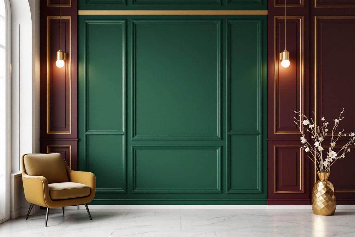
Your living room feels flat. Sterile. Like a waiting room that forgot to turn on the heat. As November approaches and daylight fades, that beige-on-beige monotony starts to feel less like “calm” and more like a void. You are not imagining it. The shift is real.
Interior design is turning the page on the era of sterile neutrals. For years, we stuck to off-whites and warm grays because they were safe. They were timeless. But in 2026, safety is boring. The trend is shifting toward deep, saturated hues that borrow heavily from the world of high-end luxury. This isn’t just about painting a wall a new color. It is about reclaiming warmth. It is about creating a cocoon that actively fights the gloom.
Why are people suddenly tired of neutral interiors? Because a pale room can amplify the grayness outside. When the sun sets at 4:30 PM, you do not want a void. You want depth. You want color that feels expensive, intentional, and alive.
Why the Neutrals Are Losing Ground in 2026
Flip through any design magazine or scroll past another Instagram post of a minimalist beige sofa, and you will see the pattern. It is everywhere. Light wood. White cushions. More white walls. This palette worked for a while. It offered a clean slate. But it lacks relief. It lacks personality.
As the days shorten, that lack of contrast starts to weigh on you. There is a growing desire for rich, saturated color trends to break the hospital-like sterility that plagues many modern homes. We are moving away from the “safe” beige. We are moving toward walls that have character.
The goal is not to clutter. The goal is to energize. A home that feels monochromatic can feel cold. Adding depth through color changes how you experience your space. It makes the room feel lived-in. It makes it feel like a sanctuary.
Where the High-End Inspiration Comes From
This shift did not happen in a vacuum. It is coming from the top down. Luxury brands in hospitality, fashion, and interior design are embracing a new chromatic vision. Think deep rubies. Night blues. Forest greens. Warm terracottas.
Look at the recent capsule collections from major retailers like Zara Home. They are prioritizing boldness and chromatic richness over classic restraint. You see these colors in Parisian salons. You see them in new concept stores in Lyon and Marseille. The message is clear: fewer neutrals. More attitude.
These hues are not loud. They are enveloping. They create a sense of refinement that cheap decor often fails to achieve. By adopting these luxury-inspired tones, you are borrowing that sense of sophistication for your own walls.
How to Transition from Neutral to Deep Color
You do not need to gut your house to make this change. You do not need to spend a fortune. In fact, the smartest approach is restraint.
“Less is more, but make the ‘less’ deeply colored.”
Here is how to bridge the gap between boring beige and luxurious color without overwhelming your senses:
- Choose one focal wall. Pick a deep shade like petrol blue, ochre, or terracotta for just one wall. Let the other walls remain neutral. This creates a anchor point without turning your home into a color box.
- Layer textiles. Swap out your plain white curtains for olive green linen. Add paprika-colored cushions. Lay down a multicolored Berber rug. These small changes add texture and warmth.
- Mix with natural materials. Balance intense colors with raw wood, unglazed ceramics, and woven seagrass. These materials soften the contrast and keep the look grounded.
- Use indirect lighting. Harsh overhead lights kill the mood. Use table lamps and wall sconces to wash the color walls with warm light. This enhances the depth of the paint and makes the room feel cozier.
A few well-placed touches can completely transform the atmosphere of a room. You are not redecorating. You are refining.
Creating Depth with Rich, Textured Tones
Winter calls for an interior that feels like a hug. The best way to achieve that is by trading immaculate white walls for colors that invite you to stay put. Think of the palette of precious stones. Deep emerald in the bedroom. Subtle burgundy in the living room. Indigo blue at the head of the bed.
These shades, inspired by luxury design, create a comforting envelope. They work especially well on cold November nights.
If you are on a tight budget, you do not need to paint the whole ceiling. Try coloring the woodwork. Paint your radiators. Add color to door frames. Even changing your throw pillows and blankets can make a significant impact. It is an easy update. It is reversible. And the effect is immediate.
The real magic happens when you pair these rich colors with textured finishes. The contrast is striking.
- Burgundy velvet paired with aged bronze creates a hushed, intimate atmosphere.
- Khaki linen mixed with light wood gives a modernized family home vibe.
- Raw ceramics and Japanese paper lamps add softness to dark corners.
By layering shades and materials, you avoid the flat, boxy feel that plagues many neutral rooms. You gain depth. You gain intimacy. This is what it takes to feel truly at home during the cold, festive season.
Palette Suggestions by Room
Different spaces require different moods. Here is how to apply these sophisticated, comfort-focused palettes without making a mistake.
The Living Room
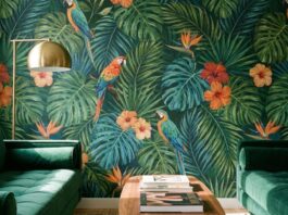
Try forest green walls paired with terracotta accents. Warm it up with touches of gold or copper hardware. This combination is earthy but refined. It feels expensive.
The Bedroom
Go for night blue on the wall behind your headboard. Keep the other walls off-white. Use natural wood furniture to tie it together. This setup promotes rest while still feeling visually interesting.
The Kitchen
Consider an ochre yellow backsplash. Pair it with blond wood cabinets and artisanal dishware. It adds a pop of energy without being distracting.
The Entryway
Use aubergine or anthracite gray. Add mirrors to bounce the light around and make the space feel larger. It sets a dramatic tone the moment you walk in.
To complete the look, bring in winter-specific materials. Wool. Boucle. Mohair. Raw ceramics. Stores like IKEA and Maisons du Monde release special collections in late autumn to help you warm up your interiors without breaking the bank. The trend is moving toward texture and depth. It is time to stop playing it safe. Your walls are ready to speak.
Why deep paint colors are the ultimate winter upgrade
You walk into a room painted in shades of beige or off-white. It’s clean. It’s safe. It feels like a waiting room. Then you swap those walls for a deep, saturated hue—forest green, midnight blue, burnt orange—and the entire atmosphere shifts. The air feels heavier, but in a good way. Warmer. Intentional.
This isn’t just decoration. It’s a psychological reset.
After years of minimalism and sterile neutrals, there is a growing movement toward using deep paint colors to create cozy winter interiors. Homeowners are ditching the “builder beige” for tones that absorb light rather than reflect it. The result is immediate. Evenings feel more intimate. The cold outside seems less relevant when the inside feels like a womb. Kids play harder. Adults slow down.
How color psychology transforms your space
Experts at trade shows like Maison&Objet aren’t just talking about aesthetics. They’re talking about behavior. Color dictates how we move through a room.
When you choose paint colors that define spaces without walls, you are essentially using hue to draw invisible lines. You don’t need a new partition to separate the living area from the dining nook. You just need a shift in tone. A subtle transition from a warm terracotta to a cool slate tells your brain, “Here we eat. Over there, we lounge.”
“Color influences mood. It encourages slowing down and savoring your cocoon, especially during the dark winter months.”
This approach highlights architectural quirks. If your house has old moldings, a deep alcove, or a crumbling fireplace, a bold color doesn’t hide the flaw. It celebrates it. The darkness around an old fireplace makes the brick pop. It turns a drafty corner into a focal point. It’s a way to honor the history of the home without spending thousands on restoration.
And let’s be clear: this isn’t about buying new furniture. It’s about using color to create a custom ambiance on a budget. It’s the ultimate “feel-good revolution.”
Practical steps to nail the look
If you’re ready to rip up the neutral carpet (metaphorically) and start painting, here is how to do it without ending up with a cave.
1. Ditch the all-neutral wall strategy
Stop painting everything the same shade of “white-ish.” It drains energy. Go deep. Look for colors with undertones—blue with green in it, red with brown in it. These complex shades feel richer and less flat than primary colors.
2. Pick one hero color per room
You don’t need a rainbow. Pick one strong tone for the walls. Keep the trim crisp (white or a tonal gray). Let that one color do the heavy lifting. Too many competing hues create visual noise. Noise causes stress.
3. Layer with natural textures
Color alone can feel flat. Add warmth back in with materials. Think chunky wool throws, linen curtains, oak furniture, or rattan baskets. The roughness of natural fibers balances the smooth, deep finish of the paint. It adds tactile depth that eyes can’t see but hands can feel.
4. Use modular, colorful accessories
Hate the color after six months? Paint is permanent. Accessories are not. Swap out cushions, vases, or rugs. This lets you adapt to trends without the dust and cost of a full repaint. It’s flexibility disguised as decor.
The verdict
Winter doesn’t have to be a season of hibernation. It can be a season of richness. By swapping beige for depth, you’re not just changing the look of your home. You’re changing how you live in it.
The luxury isn’t in the square footage. It’s in the mood. It’s in the way the light catches a deep emerald wall at 4 PM in January. It’s in the silence that feels earned, not empty.
So, what’s stopping you? Pick a shade. Buy a roller. And see