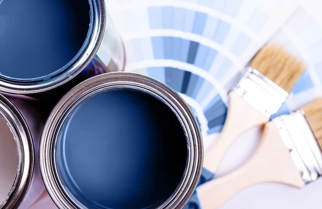
You want a calm, serene atmosphere in your home. So you decide to paint part of the house blue. Problem? You won’t find the exact shade you’re looking for. You visited several interior design stores. You have to admit it. None of the standard colors on the shelves are quite right.
Have you ever thought about mixing the perfect shade yourself? It’s not as scary as it sounds. Here’s everything you need to know about making custom blue paint.
Why store-bought blues often go unnoticed
There are thousands of colors in the big box stores. It has a lot of options. It’s also overwhelming. Manufacturers standardize palettes for mass production. They don’t take into account specific lighting or your personal taste. A blue that looks great in a catalog can look flat or muddy on a wall.
A custom blend solves this problem. You control the pigment ratio. You adjust to the natural light in your room. You get a color that is truly yours. This is especially useful if you want to know how to mix custom colors that are not available in standard colors.
Basics of color mixing
Mixing colors is not science fiction. It’s chemistry and art. You start with a base. Then add the pigment. With blue, you work on a cool spectrum.
You need the right tools. Get a clean mixing bucket. Use a mechanical drill mixer. You can buy it at any hardware store. Clean brushes are also essential. Dirty brushes contaminate the mixture.
Start with a white base. Most custom shades are added to a white or cream foundation. This ensures that the color maintains its integrity. Adding too much shade to a dark base will result in a muddy mess.
“The color is never just about the pigment. It’s about the light that hits it.”
Choosing the right pigments
Not all blues are the same. You have options.
- Phthalo Blue : Strong, synthetic pigment. It’s intense. Use sparingly. It can quickly overwhelm the mixture.
- Ultramarine Blue : warmer. It has a slight red undertone. Suitable for deeper, fuller blues.
- Cerulean Blue : Brighter. It has a greenish tint. Perfect for heavenly or airy tones.
You can buy these pigments at art supply stores or online. Look for high-quality, artist-grade pigments. They are more concentrated. You need less to achieve the desired effect.
How to mix blue paint step by step
Safety comes first. Wear gloves. Use a mask when working with dry pigments. They can be irritating to inhale.
- Prepare the base : Pour about one quart of white paint into your mixing bucket.
- Add pigment slowly : Start with a small amount of the blue pigment of your choice. A little goes a long way.
- Mix thoroughly : Use a drill mixer. Let it run for at least two minutes. Make sure no streaks are left behind.
- Test the color : Paint a small sample on a piece of cardboard. Allow to dry. The color looks different when wet.
- Adjust if necessary : Too light? More pigment. Too dark? Add a white base.
This process requires patience. But the result is worth it
How to Mix Navy Blue Without Muddying the Paint
Navy blue is a staple for modern and Scandinavian interiors. You can’t make it from scratch using secondary colors because it’s too dark. You need a base of blue paint and a touch of black.
The mistake most DIYers make is dumping in the black all at once. One moment it’s blue. The next, it’s muddy gray. Start with your blue. Add black pigment drop by drop. Mix thoroughly after each addition. The color deepens slowly.
Once you hit that deep, rich tone, stop. Then, add a tiny pinch of red. This seems counterintuitive. Red is opposite blue on the color wheel. But a hint of red neutralizes the greenish undertones often present in blue paints. It makes the navy look cleaner, deeper, and more luxurious.
This shade works with white for crisp contrast. It pairs well with powder pink for a softer look. Even yellow pops against it. Just don’t overdo the yellow. A little goes a long way.
Creating Vibrant Bright Blue
Want a pop of color that screams energy? Bright blue is high-voltage. It’s essentially primary blue lightened up.
Start with your primary blue. Add white to lighten it. But here is the trick: add a tiny amount of yellow. This doesn’t make it green. Instead, the yellow shifts the hue toward that electric, cyan-like brightness. It makes the blue feel lighter and airier.
If your mix still looks flat, try adding a splash of fluorescent blue pigment. It adds a glow that standard paint lacks. You can substitute this with a small dose of violet pigment for a cooler, more striking tone.
Pair this bright blue with white for a clean, airy room. Use yellow to create a warm, energetic vibe. Try it with gray for a modern, chic look. Or go romantic with soft pink. The combinations are endless.
The Secret to Mixing Royal Blue
Royal blue is bold. It’s the color of uniforms and royal robes. It’s intense and commanding. To mix it, you need blue and violet.
Mix blue paint with violet paint. The more violet you add, the more intense and deep the royal blue becomes. It’s a direct path to that rich, saturated look.
Don’t have violet paint? Make it. Mix blue with a bit of red. Keep the ratio lean on the red. You want a purple that leans blue, not red. Blend that into your main blue paint.
For interior design, royal blue stands out against white. It warms up nicely with yellow or orange. For a modern, eclectic feel, add silver accessories. A touch of gray can also tone down the intensity while keeping the richness.
Mixing Turquoise Blue
Turquoise brings the beach inside. It’s vibrant and refreshing. You mix blue with a touch of green. Then, add white to lighten it and dilute the intensity.
Mix until it’s uniform. If it’s too dark, add more white. If it’s too pale, add more blue. It’s about finding that sweet spot between sea and sky.
This color is versatile. It works with neutral tones like white, beige, and black. It also shines when contrasted with pink, orange, yellow, or violet. Don’t be afraid of contrast. Turquoise demands attention.
The Recipe for Sapphire Blue
Sapphire blue is deep, luxurious, and calming. It mimics the precious stone. To get it, start with primary blue. Add a hint of violet. Then, add a touch of black.
The black deepens the blue. The violet adds complexity. Adjust the ratios until it matches the depth of a sapphire. If it gets too dark, lighten it with white. Don’t overdo the white, or you’ll lose the depth.
Sapphire blue needs contrast. It doesn’t work in pastel rooms. It gets lost. It shines with bold colors like burgundy, emerald green, or deep violet. It’s a statement color. Use it wisely. It transforms a space from ordinary to opulent.